Insights
3 Tips for Transforming Data Into Visuals That Tell A Clear Story
A big part of gaining buy-in, enabling change, or effectively explaining progress depends on how we convey the data we’ve been collecting, and the story we tell about it. So while data collection and analysis can be hard, effective data presentation is even harder.
As an analyst at NICHQ, I frequently need to turn data and information into visual assets to tell a story. Making sure that those visuals are both informative and interesting is not always easy, it’s arguably as much an art as it is a science. Here are three tips for turning your data into easy-to-understand attention grabbers.
Make Your Imagery Telling
Standalone graphics should be able to deliver information beyond simple understanding at a glance. To accomplish this, every detail in a graphic should help tell your story. For example, data should never be listed in alphabetical order; instead, order a list substantially so something else can be learned (for example, countries ranked by poverty index).
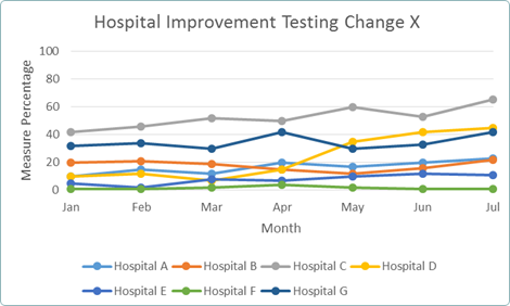
Take another example. Let’s say I wanted to tell the story of how a specific hospital was showing better improvement than the others that were testing the same change. We could display the information like this:
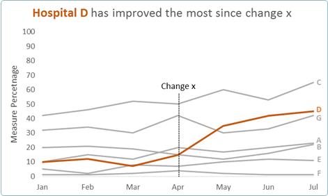
Or this:
Which of these tells you more information, more easily and effectively? For chart 1…
- The legend forces the audience to jump back and forth from line to legend to understand what’s what
- The multiple colors can confuse the viewer about what is most important, and the dots don’t provide information that the reporting months don’t already tell us
- The horizontal lines don’t really add much to the story, and could be removed
- There’s a lot of unnecessary labelling. We know the x axis values are months from their abbreviations, and we know we’re looking at hospitals, so “months” and “hospitals” are just using up your audience’s cognitive energy, as well as valuable chart real estate
- We’re left waiting with bated breath about when “change x” was.
In chart 2, removing, changing and relocating chart labels freed up a lot of space so that the line values are more easily differentiated. I weighted and colored the line for hospital D, since the other hospitals’ improvements weren’t the story I was focusing on. To further emphasize my story, I also changed my title to tell my initial point up front, removing the guesswork as to the message I’m trying to get across.
Simplicity = Better Comprehension
Presentations and major graphics should be summarizable in a way that’s similar to a scientific abstract format (i.e. tell me a story in 200 words: problem, relevance, solution). Keep refining your message, both in your visual and in your talking points, until you make it simple enough that it can be easily consumed and understood. Here is a great example of how clarifying your story can make a big difference.
Six Principle Check
When designing graphic representations of data, always ask yourself whether you’re incorporating the “Six Fundamental Principles of Analytical Design Thinking” (adopted from Edward Tufte’s phenomenal book “Beautiful Evidence”):
- Compared to what? Whether we’re looking at changes over time or doing pretty much any kind of evidence-based reasoning, we want to make intelligent and appropriate comparisons. Your visuals should help assist this kind of thinking, so show comparisons, contrasts, and differences. And please try to make sure they’re clear.
- Show causality, mechanism, explanation and systematic structure. We’re always on the lookout for patterns to help understand the reason behind information. The information you choose to show or highlight can greatly assist us in finding those data in an illuminating way.
- Show multivariate data/analysis. As Tufte says, “the world we seek to understand is profoundly multivariate.” Graphs take up important real estate, so make sure the information you’re displaying represents multiple variables, but strike a balance between telling a rich story and cramming too much data onto your page. Simplicity and clarity still go a long way.
- Completely integrate words, numbers, images and diagrams. A graph is nearly meanlingless without labels describing what it’s showing. Important labels, annotations, and numbers should be integrated into the appropriate sections of a graph as seamlessly as possible. This eases rapid understanding by your audience, and lets your graph do a lot of the explanatory work for you.
- Show me the Evidence. Evidence begets confidence. Proper documentation of where the data comes from is paramount if you want your audience to use your graphics as a jumping off point for deeper analysis and thinking. Without this information, an audience could get more caught up in asking these questions than paying attention to your data. So remember to provide a detailed title, authors/sponsors, data sources, measure scales, and note any relevant issues.
- Content is King. Analytical presentations ultimately stand or fall depending on the quality, relevance, and integrity of their content. You first need to have something to say before you can say it effectively. Also, make sure you double check for mistakes.
Following these principles will provide considerably more value and impact to your audience. Happy charting!
Julius Anastasio is an analyst at NICHQ